Every year Pantone releases its ‘colour of the year’ and it helps guide the trends we will see in our homes. Pantone is pretty much the entire world’s go-to-resource for colour matching, design, and colour trends. Each year they, along with other colour heavy hitters like Benjamin Moore, Para Paints, Sico, Sherwin Williams and other paint or colour companies pick a colour they think represents the year to come, what we’ll see in our homes, in our closets, and even in marketing and advertising.
When it comes to the Pantone colour of the year, it is as much political statement and thought-provoking as it is fluffy throw pillows. The colour Pantone has picked for 2019 is called Living Coral and this bright cheerful colour will be everywhere, if it isn’t already.
Described by Pantone as a happy and optimistic colour, Living Coral is a great way to infuse a little sunshine into your home furnishings.
Does this lively and slightly nostalgic colour speak to you? Want to use it in your home? We’ve rounded up some great examples of just how to use the colour of the year in your home:
This area rug combined with a simple throw and pillow is the perfect POP of colour for this navy and grey bedroom.

This wing chair pair is really living a lively coral life.

This coral ottoman is a great way to add colour and function to this wonderful living room space.
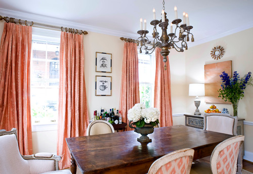
Curtains and a pop of coral on the dining room chairs make for a great combo in this dining room.
Source: Houzz
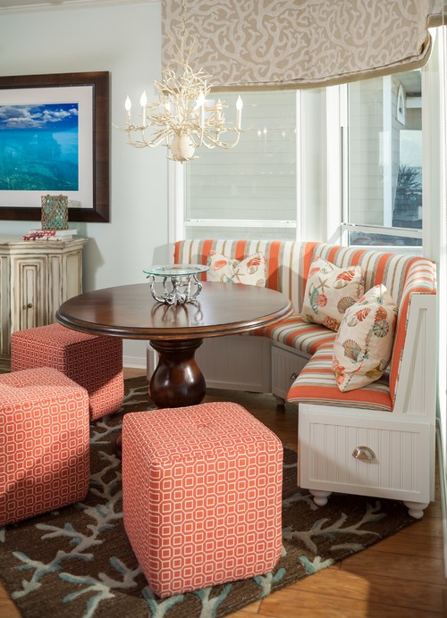
This cozy breakfast nook looks like a very happy place to enjoy food and company.
We hope you are inspired to use the 2019 colour of the year in your home.
Rebecca, Your Furniture Expert